About Our Logo
MCAP's Logo
MCAP's logo is a collaborative design by co-directors Kristine Marceau and Trent Mize, with some additional artwork from faculty affiliate Josh Doyle.
The logo includes numerous methodological references, which we explain below.
Du Bois Spiral Chart
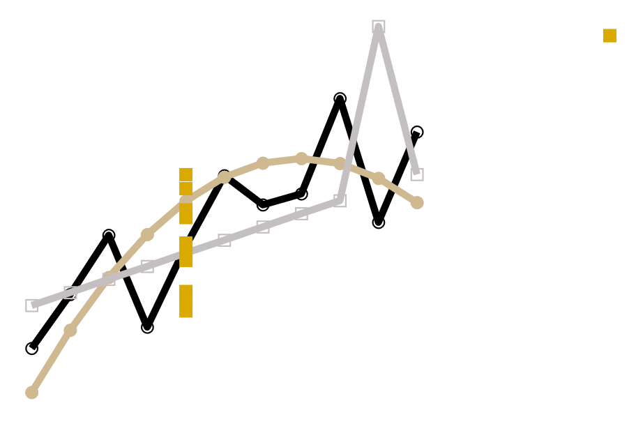
The bottom left circle in the MCAP logo includes a recreation of sociologist W.E.B. Du Bois's spiral chart. Trent Mize recreated the chart in Purdue colors by adapting Asjad Naqvi's Stata replication.
Read more about Du Bois's pioneering work in the field of data visualization in this article from The Smithsonian.

Minard's Infographic on Napoleon's 1812 March
The top left circle in the MCAP logo includes the famous infographic by Charles Minard which displays Napoleon's 1812 march to Moscow (it did not go well). Data visualization pioneer Edward Tufte called it "probably the best statistical graphic ever drawn." And the original is in Purdue colors!
Read more about the infographic here.

A Productive Exchange Network
The top middle circle in the MCAP logo shows a productive exchange network, which is the type of network MCAP represents. In productive exchange, multiple people and/or groups are connected through a centralized hub or idea and work together through the hub to produce better outcomes. Productive exchange networks have been found to be the most productive type of network (hence the name!) and to produce the most positive emotion for members.
Read more about exchange networks in Lawler (2018).

Anscombe's Quartet
The top right circle in the MCAP logo shows Francis Anscombe's quartet, a famous example of why data visualization is so important. Each of the four sets of data have identical summary statistics and produce equal correlations. But, the relationships differ dramatically which is easily seen when the data is visualized. Trent Mize recreated the example in Stata using Purdue colors.
Read more about Anscombe's quartet on Wikipedia.

MCAP Pedagogy in a MCAP Cap
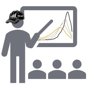
The bottom right circle in the MCAP logo depicts one of MCAP's core missions: good methodological pedagogy. The instructor is teaching about kernel density plots (which Trent Mize created in Stata using Purdue colors).
The instructor is wearing a MCAP cap designed by faculty affiliate Josh Doyle.

